Kinetix
Industry
Cloud Technology
Category
Brand Design, Web Design
Year
2026

Kinetix is a New Zealand cloud solutions company entering a market dominated by names people already trust. The team knew cloud infrastructure and had services ready to sell — what they didn't have was a logo, a website, or any way for a stranger to tell them apart. We built the identity and website from the ground up, designed to make a new company look established from day one.


the challenge
A new name in an industry that runs on trust. Kinetix had the technical offering, but no logo, no visual language and no website. In cloud services, buyers judge credibility long before they read a spec sheet — and with two default assumptions in the market, hyperscaler or reseller, a new company has to earn attention before it can earn a contract. The brand had to do that work first.
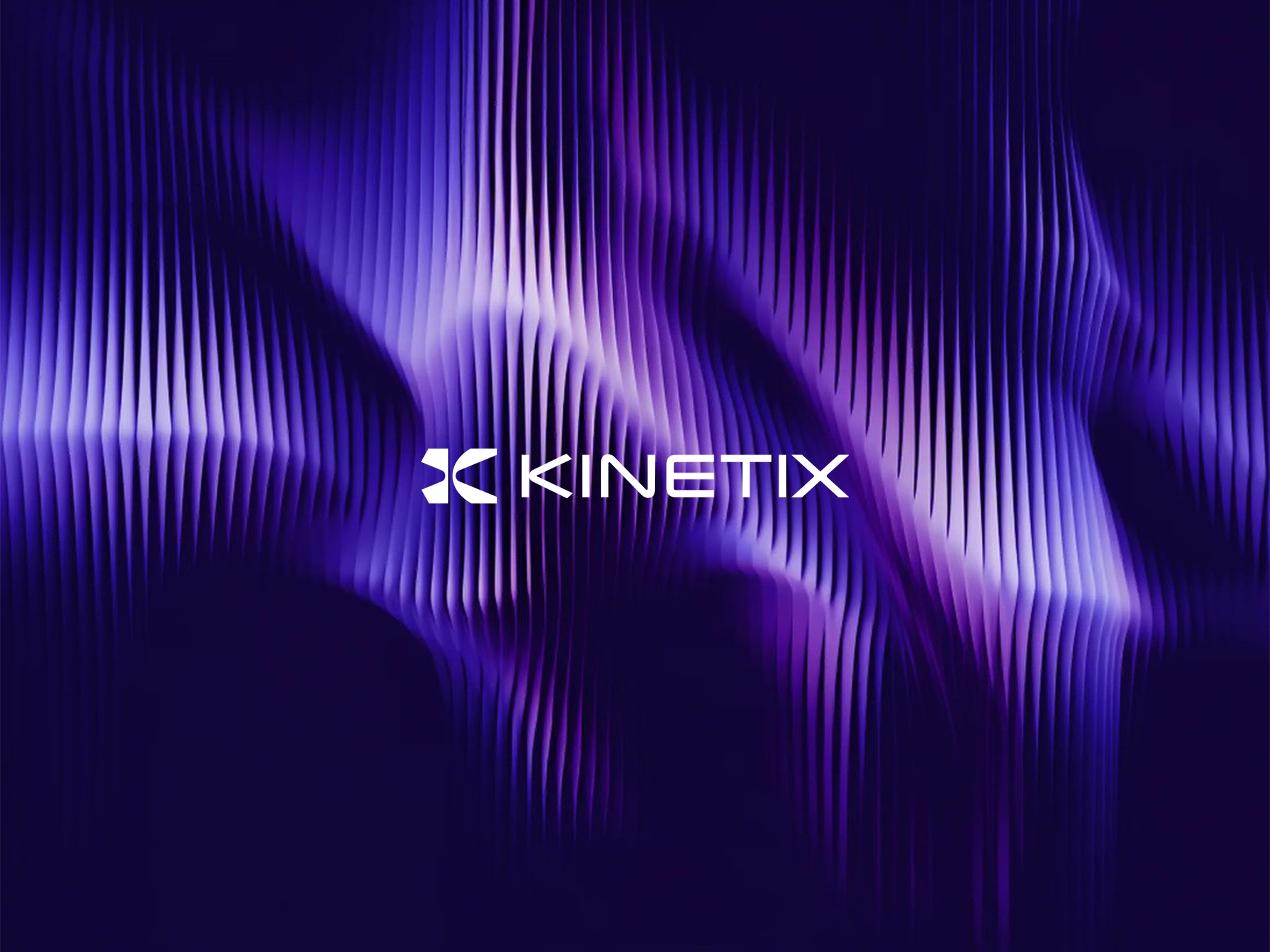
The mark is built around motion. The name comes from kinetic energy, so the logo does too: a K formed by two opposing shapes, suggesting movement and data in transit. A clean geometric wordmark, a deep violet palette — chosen partly because most cloud companies default to blue — and generous negative space keep it technical without feeling cold. The website carries the same system across every page, with plain-language service descriptions so a non-technical decision-maker understands what Kinetix does without needing an engineer in the room.
conclusion
Kinetix launched with a complete brand system and a live website — ready to pitch, sell and scale from its first client meeting. The identity didn't make the technology better. It made the technology believable to someone who had no other reason to believe it.